
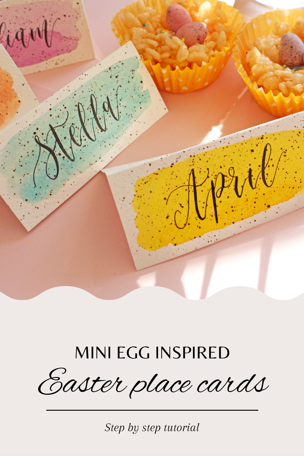
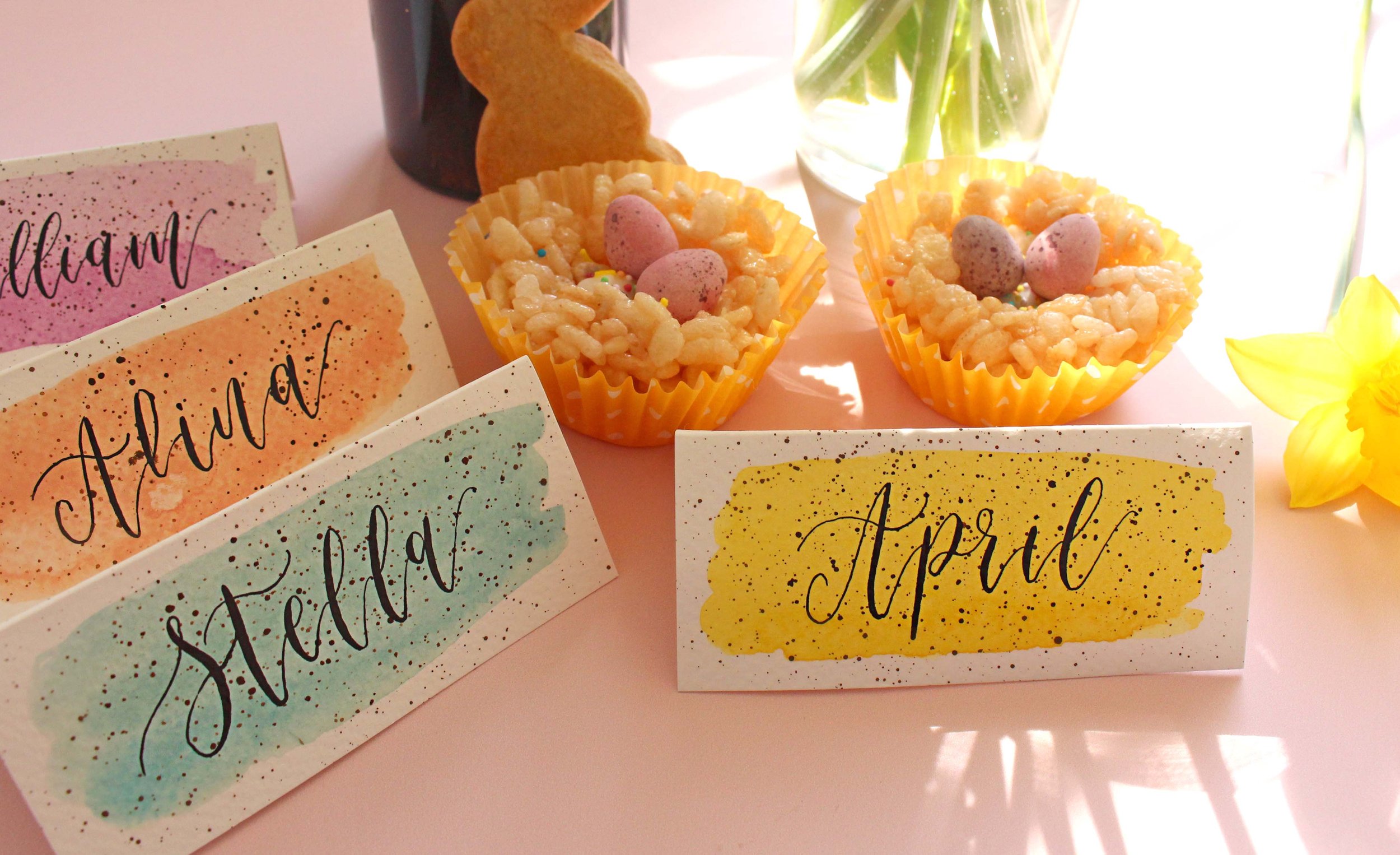
Mini Egg Easter Place Cards - Step by step tutorial
I’ve got an exciting little Easter project for you here! The other day I saw a photo of Easter egg design nails and naturally, I got very curious about making something calligraphy related in a similar design. I thought that place cards would be a perfect project for that. Maybe you’re having a little get together with friends and family, or maybe it’s just you and your partner and your fur baby. Putting your calligraphy skills to good use whenever you can… are you with me?
I made these for my daughter, myself (very strange to letter my own name haha), my partner and our doggie (she’s getting a special Easter treat too, but her name card won’t go on the table I’m afraid).
Let’s get to it! I’ll share the step by step process and will give you a few tips throughout as well so you don’t make the same mistakes I did.
Step 1
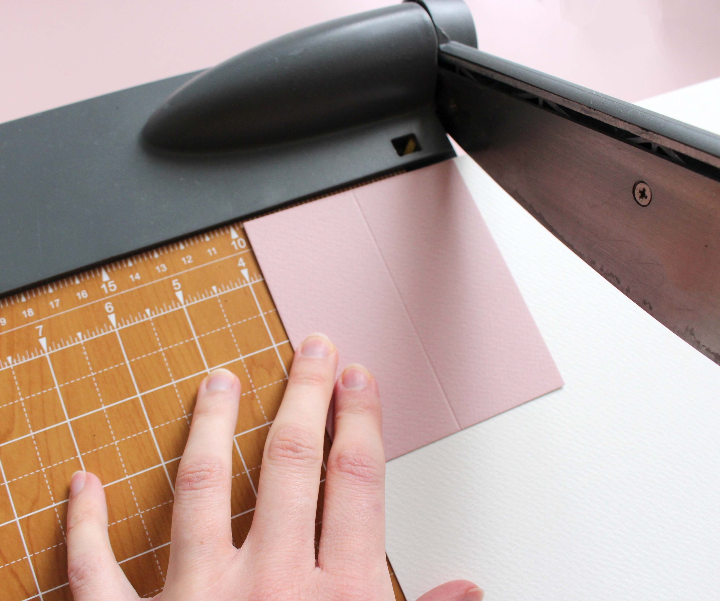
Let’s prepare the place cards. You can use the ready made, pre-folded ones, but I specifically wanted these to be on watercolour paper, so I’m cutting my own. I’m using sheets of paper from the Winsor and Newton watercolour pad and trimming them to the size I need. I used a readymade place card I had for guidance, the size I cut to was 10cm (length) x 9cm (height). Remember we’ll need to fold them in half.
Step 2
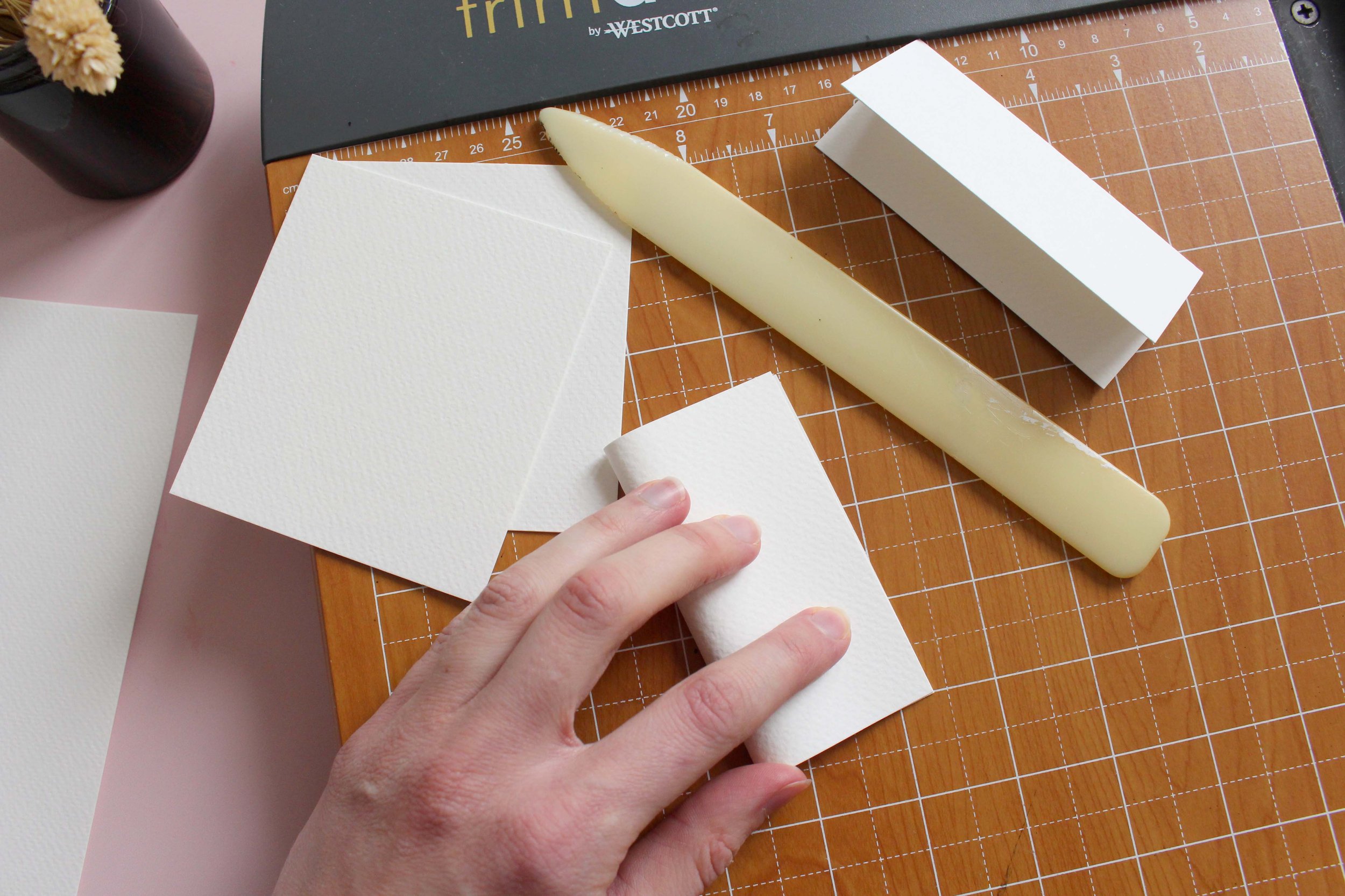
Once they’re all cut, align the corners and fold them in half lengthways. Remember to keep the correct side of watercolour paper on top as that’s where the watercolour will go.
You can use a bone folding tool to help you crease them nicely.

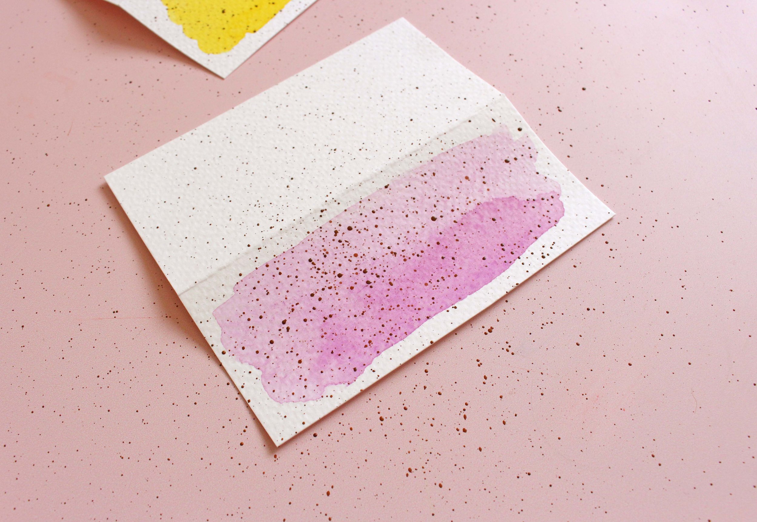
Step 3
Let’s do the watercolour background wash. I used the Prima Marketing Confections palette and went for coral, lilac, pale blue and yellow. Dip a round water brush in water, dilute your paint and use the belly of the brush to do long strokes sideways. Starting from the top of the place card going down.

I recommend weighing the place cards down with something while they’re drying. I just used an ink pot here. It helps the watercolour to dry evenly without accumulating in the corners and forming dark patches.

Step 4
Let’s make a place card template!

While the place cards are drying let’s make some guidelines for lettering. I love making a little example sheet as you can reuse it for other projects too. It helps to keep your lettering fairly aligned and centred without drawing pencil guidelines on the actual place card.
We’re not robots and it can be quite difficult eyeballing it and free styling with no guidelines at all.
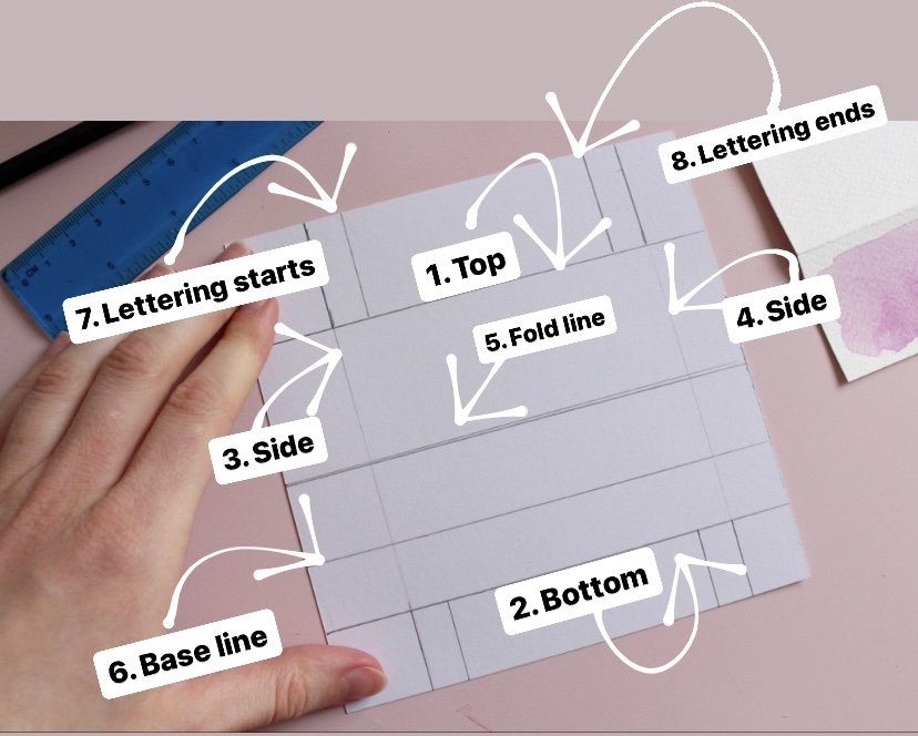
REFER TO THE PHOTO BELOW WHEN READING THIS
I usually grab a separate page, and start by drawing a little frame of my actual place card by placing it down and drawing around the edge: top (1) , bottom (2) and the sides (3, 4) to show where it starts and ends.
Then I add in a fold line as well (5). From there I draw a horizontal base line, imagining that I’m positioning my calligraphy on that line (6). If your lettering style is bouncy the base line can be higher up, or if you tend to letter in classic looking style, you want it to be a bit lower.
And the last 2 vertical lines are showing where I’d like my lettering to start and end (7, 8). Always allow a bit of room on both sides.
Remember that these are just guidelines, it’s very normal for your to go slightly over them.
Step 5
For the speckled effect I used a dark brown from a different palette and added a bit of water to dilute it. Keeping it fairly thick for this next step…

Dip your brush and grab another pen or pencil in another hand and cross them like this. Now tap the brush with your pen (quite strongly) and keep moving your hand to cover all place cards in speckles all over. Move closer for more saturated effect and add more water for bigger drops. It’s messy so you’ll want to clean the surface right away before it dries.


Step 6
When the place cards have completely dried it’s time to do some lettering. You can use a brush pen if you like, but i went for a dip pen this time. It’s a bit easier to make it look neat on textured paper I think.
I used my Speedball Straight Pen holder with a Nikko G nib and black Sumi ink to do the calligraphy. It’s always a bit tricky lettering on top of watercolours, so preferably you’d leave it to dry overnight as even if it appears dry, the ink can bleed a bit if it hasn’t been long since you painted it.
I didn’t wait long and just went for it, so I had to be very careful with the ink flow. I recommend dipping less and making sure your nib is not overfilled with ink as it can come out in a big blob. Take it slowly and start with a little bit of ink and dip more if you need to.

And here we are, the place cards are ready! Happy Easter!
If you enjoyed this little project let me know in the comments below. It always motivates me to create more!.
Some of the links in this blog post are affiliate links. This means I may earn a small commission if you make a purchase through these links, at no extra cost to you. Your support helps keep this blog running. Thank you!
Did you know that by signing up to my Blooming Calligraphers membership you'll get instant access to the exclusive worksheet library, engaging calligraphy and watercolour projects, and fresh monthly content? Become a member today, sign up here
Let's connect:
Instagram: http://instagram.com/creativefeeldesigns
E-mail: hello@creativefeeldesigns.com
www.creativefeeldesigns.com