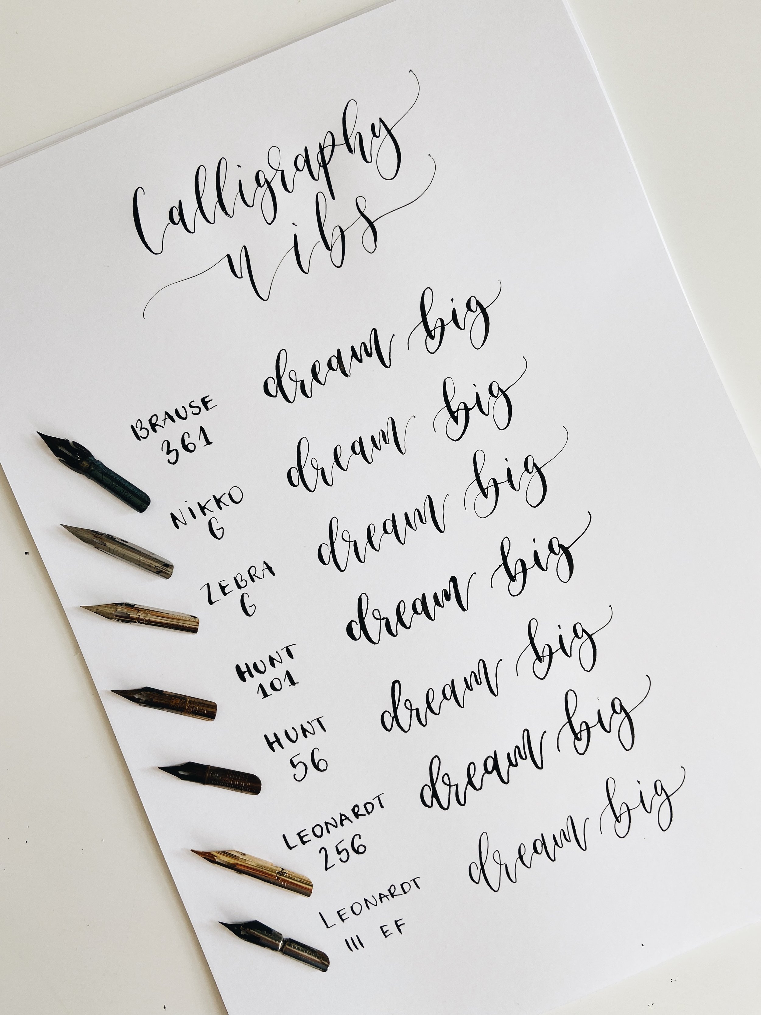
Trying out different nibs - dip pen calligraphy
So I only use one or two of these nibs day to day, I sort of landed on them as my favourites and my hand has gotten used to them. They're Nikko G and Zebra G nibs. However, trying out different nibs can be especially helpful if you're heavy handed and haven't quite found the nib that feels easy to work with.
I love having a little collection of nibs as they can be used to achieve different lettering styles. The ones in the photo are nibs that I keep for certain projects and they're my current favourites.
There are nibs that are commonly know to be best for modern calligraphy but I also tried to include some more niche ones that are rarely talked about.
Let's start from the top.
Brause Steno 361 nib - this is a lovely nib if you're looking for thick juicy downstrokes. I find that it likes very light pressure and works better when you lower your pen holder a bit more. Strangely it doesn't work too well with certain types of ink. I've tried some pigment based inks with it (gouache mixed with water and gum arabic) and I think it didn't like the glossy texture that the gum arabic adds to the ink. The flow seemed to be quite uneven. It worked fine with my usual Higgins black ink though. I know that many calligraphers swear by this nib and it can indeed add a lot of style to your lettering.
Nikko G - hello my favourite! This is my all time favourite nib. It's the one I learned calligraphy with and it's the one I recommend to my students the most. It's just everything you need. It's flexible yet easy to control. It makes lovely delicate upstrokes but they're thick enough to be visible even with metallic inks. It works well on different textures and I find it manageable to letter with on cotton paper. It does catch paper fibres quite often but that's something to expect from handmade paper and can be fixed by wiping your nib with a tissue throughout lettering. I use it for place cards, vow books, greeting cards etc. A lovely nib and especially good for beginners.
Zebra G - I came across this nib by mistakenly ordering it and I remember letting it sit on the shelf for 6 months before giving it a go. I was very reluctant as I was sure there's no better nib than Nikko G haha! I was wrong, I've recently learnt to love it a lot. It's very similar to Nikko G but it glides a bit better, has more of a defined tip that makes it less scratchy and it has even more delicate upstrokes. I find it easier to use with metallic inks in particular (eg. Coliro pearlcolours). It's the nib I use for lettering all of my place card orders at the moment.A quick note - I noticed that it doesn't quite fit in some pen holders. Perhaps it's a bit thinner, so make sure it's inserted securely.
Hunt 101 - So this one might feel very unusual if you've never tried it before. It's generally shorter and smaller than other nibs. One of the nibs that bends very easily so can be a bit more difficult to control the pressure. It achieves beautiful thickness though, much thicker than the Brause nib. Can be used on smooth and textured surfaces. Long slow movements is the way to go with this nib, I found that's when it glides the best.
Hunt 56 - I replaced my Gillott 404 nib with this and I find them very similar.
Feels like a nice delicate nib, crates beautiful hairlines. However I do find it bit more scratchy than other nibs. Good for small scale lettering, I wouldn't do anything much bigger with it I don't think.
Leonardt 256 - this nib is great for drawing and writing and can also be used on china and porcelain. I found it quite inky overall, it produced very wet strokes. The ink seems to last particularly long in it which I like, so doesn't require much dipping. It's also quite a visually appealing nib, feels very nice to letter with.
Leonardt 111 EF - this is a manuscript nib and especially lovely for fine look lettering. I love how it adds a simple look as the contrast between thick and thin isn't as obvious. I imagine using these for simple look wedding stationery pieces - menus, invites and place cards. Definitely satisfying to letter with, can be lettered with very light pressure. Also good for Copperplate and Spencerian styles (I also recommend trying out Leonardt EF principal nib)
I hope you found this guide useful. Let me know if you've tried some of these out and your thoughts.
Extra note - remember to always treat brand new nibs. They come with a manufacture coating that needs to be removed prior to lettering.
You can refer to this video to learn how to treat them.
It's easy to give up on nibs that are not properly treated as they'll affect the ink flow and will be very difficult to work with.
Some nibs might need to be treated more than once. Always test and assess if once is enough.

